Triathlon Intelligence: A Calendar View Template For Triathletes

For the past few years, I have been not only training for triathlon, but also talking to fellow triathletes about triathlon performance.  The concept of triathlon intelligence is alive and well in the minds of anyone looking to improve their triathlon finish times.  Not finding much excitement with the training and workout logs on the market, I created TrainingMetrix  (out of business – Oct-2015)to explore the intersection between data and triathlon, as well as data and fitness in general. From usability and access to data to creating KPIs for workouts and nutrition, TrainingMetrix took an open exploration of this often overlooked intersection.

Our latest template, based on feedback from our users, is a modification of our free Triathlon Foundation Template and adds the ability to view both workouts and training plan in a calendar view.  Now, you can see your workouts compared against your plan! This is in addition to the powerful performance dashboard already a part of the free template.  The new Calendar View Template also allows you to build your own training plan.

calendar view triathlon workout and training log

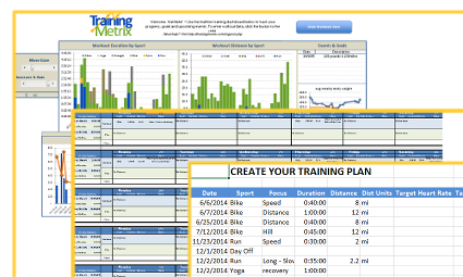
Track progess, merge your plan and workouts into a calendar view, and create/modify your own training plan, the Calendar View Template is a powerful for triathletes

I am excited to show off this latest template.  We are combining a number of KPIs for triathletes into an easy to use template which resides locally on your computer, so your data is private and protected.  Being based in Excel, the template provides a foundation for you to customize and create your own charts and data views.  The power of workout progress and trends come alive.  The ability to create and modify your training plan is another powerful tool.  Lastly, the comparison of training plan to actual workouts is the intelligence the triathlete needs to stay on track, plan ahead and adjust as necessary.  For more information, please visit the Calendar View Template website.

What’s next for TrainingMetrix and I?  A lot, stay tuned, we are just getting started with understanding this intersection, data and triathlon.

Update 10/15 – TrainingMetrix was shut down in October 2015 due to increasing costs and lack of an effective business model.

A Sample Corporate Sales Dashboard

Monitoring your Sales team performance is very important for the growth of your company whether it is an infant startup or a tenured enterprise.  If your company is using a CRM solution, such as Salesforce.com or SugarCRM, you already have a wealth of data to leverage.  The trick is to get the right level of actionable data in front of the stakeholders who need it to make a decision.

A Sample Sales Team Dashboard

The dashboard’s purpose below is to communicate the health of a sales team for a company based in Canada.  The stakeholder required a view of sales by region and product category.  In addition, they wanted visibility into product returns and profitability. We used Tableau Public to create the dashboard below with a Canada Superstore data set available for free.  So let’s dive into the dashboard and some of the insights it gives us.

Sales Team Performance

sample sales dashboard using TableauThe first three charts on the dashboard illustrate which regions and product categories are driving the most gross revenue.   The first heat map shows Product Category against Region with the darker green color indicating more revenue.  The conclusion is the West drives the most revenue of the regions, with Nunavut bringing up the rear.  However, technology sales are highest in the West, whereas other regions have a more equal distribution.

The second heat map shows Customer Segment against Product Category.  Corporate customers tend to drive the most revenue, with technology and furniture being the highest revenue generator.  The lowest generator is Consumer Office Supplies.

Continue reading

Anti-Cloud Based Tools for Personal Intelligence

Creating a personal intelligence platform for self tracking has never been easier.  While technology continues to push us toward the “cloud” and SaaS as a strategy of revenue generation, we cannot overlook the tried and true platforms available to keep data on your computer and away from prying eyes of Analysts.

As a data visualization and KPI development guru, I love finding those interesting trends in my own life that drive smarter, better habits.  If you are like me, you don’t feel comfortable sharing your dirty underwear with Mark Zuckerberg and you really wonder what Google is doing with all of that data they keep acquiring.   By maintaining a self database on my desktop computer which I can add to and tweak at a whim, I am able to give myself peace of mind and control over MY data.  Curious, about what KPI’s I track?  Stay tuned, that is a topic of another post.

Without further ado, here are some tools that you can use to create your own personal intelligence platform on your local computer:

  • Microsoft Excel
    • A stunningly powerful tool to use for even the novice user.  Create your own tables, link them how you want and design your own graphs and dashboards at your own pace and complexity.  Available for both Windows and Mac.
  • Numbers
    • A Mac only platform designed to compete directly Microsoft Excel which offers much the same functionality, but lacks some advanced capability compared with Excel.  The simplicity and robust visual que are 2nd to none, but as the data set grows, you may be wishing you chose Excel in the beginning.
  • Qlikview Free
    • I have been a fan of Qlikview for years.  I love the ability to create charts and dashboards from Excel spreadsheets and the gnarly level of interactivity that it provides.  The learning curve isn’t as steep as one might think and well worth a few minutes reading their documentation.   The limitation here is the limited number of shared files you can open.  Windows only.
  • MySQL / Apache / PHP / HTML5 / HighCharts
    • Ok, if you are going with this option, you are a true geek with coding ability.  This isn’t for the lighthearted as configuring MySQL, Apache, etc etc will take time.  But the advantage is you are left with an enterprise class database and a truly blank slate in regards to dashboards.  You can even create your own forms in HTML to add data.  Mac/Linux/Windows
  • Microsoft Access
    • If you need something in between Excel and MySQL to store data, Access is a great option and can interface with Excel graphs and dashboards.  With a mild learning curve, the ability to store any kind of data, and the convenience of a query builder UI, Access makes for a very robust solution. But, it lacks more advanced visualization, so be prepared to connect Excel to Access. Windows only and available with Office Professional.

As you can see, creating a Personal Intelligence platform off the cloud is possible.  You can take full control of your data and keep it private at the same time.  As data becomes more and more of a commodity and SaaS business models continue to nickel and dime everything, home based data management will be more and more appealing.  Excel is the perfect anti-cloud.

Why Use Google Adwords to Get Started on Marketing

I run a startup called TrainingMetrix, a company dedicated to bringing accessible analytics to fitness users around the world.

With a beta release of our first online product for triathletes, we needed to start a marketing campaign or two to draw in traffic beyond the inner circle of developers and “friend” based beta testers.   We aren’t fans of Facebook, so using a Facebook Ad campaign was not an option.

Google Adwords was a suggestion from a friend of mine.  As it turns out, Adwords is a great platform to get started on.  You can set a budget, big or small, you can run one or many campaigns for as long as you want and the text “adwords” means you don’t have to have a graphic artist and fancy banner ads to attract customers.  For us, the control, flexibility, and simplistic nature was why we chose Adwords for our first marketing platform.

So, we signed up with Google Adwords and started experimenting.  We had two goals for this project:

  1. Test the waters with different keywords, messaging, and landing page styles to understand trigger words
  2. How effective Adwords are in terms of cost

We setup four different campaigns, each with two separate Ads and sat back.  Before too long, we were getting plenty of traffic to the site.  We let the campaigns run for one week and then ran a report.  The results were fascinating to us and exactly what we were looking for.  Our first goal was met.

As for our second goal, the cost of Adwords was within our budget, but the overall cost per acquisition (CPA) was quite high, higher than we expected.  If we had Lifetime Value data to compare against, we could make a smart decision as to whether or not to continue on.  Since we are in the beta phase and not collecting revenue, the overall costs of the campaigns were acceptable, on budget and appropriate for the knowledge that we gained.

If you have a startup, please consider using Adwords as a jumping off platform for marketing. Leverage the simplicity, the control and the knowledge that you can get from it.

What Makes a KPI Special

A key performance indicator (KPI) is a vital tool for an organization seeking grow smart profits, expand customer loyalty, and build a scalable workforce.  While many companies stick a chronological set of numbers on a chart to project it on a wall in front of stakeholders, the reality is what they are seeing may not be a true KPI.   Its just a number unless its special.

To be special, the number needs to have most of the following characteristics in common:

  1. Represents a hierarchy either by time, or by dimension
    1.  Example: Sales broken by Year, Quarter, Month, Week or even day, then sliced by Sales Region
  2. Directly actionable with each stakeholder holding a piece of the action.
    1. Example: Sales are down 15% from goal, Sales Managers, Marketing Coordinators, etc can all speak to how their actions influenced the number
  3. Has  common definition across departments throughout the company
    1. Example: A sale is an action by a user from a variety of channels and promotions that resulted in payment and excludes affiliates for instance.  This definition is signed off by Marketing, Customer Service, Sales, and Product.
  4. Does not include hidden meaning and/or does not hide a trend
    1. Example: A number compared year over year, month over month completely ignores a trend that can be alarming.  While sales could be up year over year, this metric could hide a sudden drop in sales from the beginning of the year.
  5. When displayed with other metrics on a dashboard, the number represents a part of the story and does not represent a conflict to other metrics.
    1. Example: A number is where a chart shows Sales sky-rocketing, but another chart shows New Revenue way down, and yet another charts show Average Deal Size (ADS) flat.  The three charts give conflicting information, so one or more can’t be a true KPI for this business.  In fact, in this case, Sales is the corrupted KPI as it does not conform to a standardized definition.
  6. Supporting data is transparent
    1. Example: Analysts should be able to review aggregate data that rolls up to the KPI for audit reasons.  It provides transparency and allows for drill down capabilities. Often the Analysts receive direct support from a data team are sourced from data sources throughout the business.
  7. The number evolves with the business
    1. Example: A number is just a number unless it can change readily with the business. A team supports the KPI, new data is added when created, and definitions evolve as the understanding of the business evolves.
  8. A goal can easily be set and tracked from the number
    1. Example: If the number is fully understood, a goal can be set and tracked against.  If you can’t answer, “Where do we need to be by the end of the Year?”, then its a number, not a KPI.

Throughout my career, I’ve seen numbers and I’ve seen KPI’s.  The most successful companies I worked with not only have a data team to support their KPIs, but they engage in regular discussions of the KPIs at all levels of the business.  Successful, scalable, and profitable businesses are the ones using special numbers at their core.

When was the last time you saw a number masquerading as a KPI?