Going Spatial: Creating a Map of Prop 37 Votes

When charts bore you, create a map!

Spatial Analysis is increasingly importantAs I continue my sabbatical, one of the projects I am working on is earning a certification in Geographic Information Systems (GIS).  Why?  For much of my career I have been creating charts… charts showing revenue growth over time, charts showing sales rep performance, and charts showing the health of a SaaS startup.   After 15-years of charts, I felt it was time to explore another form of data visualization.

I enrolled in the GIS Specialization offered on Coursera and created by UC Davis.  I am all too familiar with data transformation, data management, and blending of data, so I was really curious how different a GIS would be compared to the likes of Salesforce.com of Tableau (which does offer mapping).

The Fundamentals of GIS course itself is much more about learning to use ArcGIS and ArcMap.  We did learn about projections, GIS best practices, what spatial analysis really is and how to open the ArcMap software.  Aside from learning the tool and file types, there really wasn’t much different from what I already knew as a data and insights analyst.

Take the final peer-graded assignment for Fundamentals of GIS as an example.  The course provides data including a counties data file defining counties in California.  The course also provides a second data file including voting precincts and the voting results for Prop 37.   The goal is to combine the two data files and create a normalized map showing the ratio of Yes votes to total votes. Seems simple enough?

It was fairly simple.  As with any data related project, the first thing you do is to download and validate the data.  Can you open the zip files?  Is the data there in its entirety? Once you know the data is usable, get to know the data.  Look at the metadata to see what fields are included and what they mean.  Since we have two files which need to be combined, we need to find a primary key to join them.

While it took me a few minutes to review the data, it took a bit longer to understand the connection between the two data sets.  It was clear that we needed to have a one to many join and a spatial join.  There are a few different ways to do this. I first decided to summarize the precinct data and output a table which showed the total votes per precinct.  I can then join this table to the Counties data as a one to one join.

Alternatively, you can join the two data sets using the Spatial Join Tool.  Instead of joining on a common key (I joined on County number), you can join them based on their proximity such as an intersect or contains.

Prop 37 Voter Map created with ArcGIS
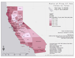
Once the data is ready to display on the map, you can use “Symbology” of the joined data layer to display a normalized ratio.  Showing absolute numbers of Yes votes does not really tell the whole story as some precincts and counties have greater populations. Normalize the Yes votes by calculating the ratio of Yes votes to total.  This produces the map we were looking for.  Once we add the required metadata, scale, etc, we can export it. (view my map online here)

What did I learn from taking this course?  Spatial analysis is a specialized field which does not differ too much from more traditional data analytics.  The course taught me the special files formats, terminology, and ArcGIS basics.  What is most interesting to me is this map could be made with other platforms like Tableau and PowerBI.  The only difference is the data must be manipulated outside the software (in Excel, maybe) and then visualized.

This brings up a great point.  In traditional analytics and business intelligence, you work with specialized tools which handle a specific part of data.  From the ETL (Talend or Kettle) to analysis (Excel or Python) to visualization (Tableau or Qlik), each segment of the data journey required different software.  Today, the lines are blending a bit.  Solutions like Alteryx combines ETL with analysis, but leaves a lot to be desired in terms of visualization.  Tableau is also able to connect to and blend a variety of data sources, but leaves some to be desired in analysis.

After taking this course I am left with a profound sense of how specialized GIS is. I can understand why it is well worth investing in, especially for geospatial analysis consisting of multiple data layers.  When you consider ArcGIS (or GIS in general) is capable of global level analysis, it takes your breathe away.

My eyes are open to how I can leverage GIS and merge it with my interest in History. Perhaps creating a historic spatial database which illustrates the speed at which Manifest Destiny occurred?  Maybe we can start with a map of Texas and how it was settled over time? Stay tuned…

Perspectives in Analytics

Implementing Analytics is a lot like making pizza.   The end result is fabulous, a very yummy pizza with our favorite toppings.  But how we make that pizza, can vary quite wildly.  Even the ingredients we use can vary as do the toppings.

If the goal is our favorite yummy pizza, businesses have the goal of building an analytics program which represents their business model and their strategy.  These Key Performance Indicators (KPIs) can vary wildly, even for businesses operating in a similar market.  The KPIs are our toppings.  Pepperoni for some and others avoid the anchovies.

How we support those KPIs can be vary as well.  What type of dough do you like?  Do you make the dough from scratch or buy a premade dough?  What do we add to the dough for interest?  Basil?  The dough is our technology stack.  You can build something completely custom with anjular.js and d3.js or you can buy something off the shelf, like Google Data Studio or implement Alteryx and Tableau.  There are no right or wrong answers, just the best decision for the needs of your business.  Low-budget frozen pizza to high-end gourmet pizza cooked in a pizza oven, the flavors vary.

The best advice I can give is to consider the sustainability of any stack before implementing.  Knowing the complexity and amount of data will ever increase is crucial. Being able to modify reports and deploy new ones fast is key to success.  Don’t forget KPIs can evolve as well and need to be reviewed regularly.

Happy Pizza Making! Er… happy analytics developing?


Early 2018 Updates

It is time for a quick update on my 2018.  I have been pretty lax about posting here as most of my content is being posted on my Patreon profile.  For just $5.00 per month you can get access to all of my content.  Content includes articles, podcasts, and videos on business, analytics, productivity, wellness, and creativity.   The focus is providing inspiration and knowledge to enhance your own experience. So head over to my profile and sign up.  Just don’t watch my horrible intro video.  lol

Onward to the good stuff!

Aric’s Q1 2018 Update

Shapr

Are you tired of LinkedIn?  Has LinkedIn gotten a bit personal? Tired or recruiters harassing you who have never looked at your profile?  Luckily, there is a cure.  It is an app called Shapr.  Think of it as the Tinder app for professionals and networking.  You signup easily and then you tell it up to 10 skills and give it your location.  It matches you to professionals with similar skills and interests.  You can then chat, meet for coffee/lunch or even just have a video call.

For me, it has been phenomenal in networking with fellow analytics gurus in my area.  I have already met with a half dozen and have developed a broader network for clients and employment opportunities.  It is great.  By comparison, LinkedIn is embarrassingly bloated.  lol

The Creative World

Early in my career, I cared a lot about gadgets, tech, and having cool stuff.  After a few moves and having to deal with all that stuff, I have decided to significantly downsize.  No more stuff for the sake of having stuff.  I have reduced my furniture down to the essentials, dumped half the stuff in my kitchen I never used, or used only once, and reduced my wardrobe down to a week worth of clothes.

This leaves the door open for more creativity.  Not only do I have tons of room in my small studio apartment, but I have a free mind as well.  Not being surrounded by all that stuff has cleared the air.  I now look forward to coming home and using this great space for projects and expanding my business.

After seeing technology de-innovate over the past two years (iOS 11 is backwards) with minimalist interfaces and complicated gestures, more and more data collection, and annoying ads everywhere, I have begun reducing my reliance on tech.  I am planning on getting rid of my iPhone and replacing it with a dumb flip phone.  I will use a small tablet for the sake of convenience at the coffee shop.  I will also dust off my S95 camera so I don’t miss anything and can document my adventures at any moment.

Having less technology around me reminds me that Americans truly work too hard.  We are given the conveniences so corporations can profit from us, keep us connected.  I don’t mean a conspiracy theory, but look at Europe, they are happier and work less than we do.  Do we really want driver-less cars so we can start work the moment we leave or houses?  Just stop and ask yourself, what is technology really doing for me?  If you love it, great.  If you wonder if the grass is greener with less tech in your life, give it a shot and cut back.

The creative world comes alive when you limit the technology, the stuff, and clear the air in your home.  For me, I have renewed energy for podcasts, creating online courses for SpiralAnalytics, and even painting (I recent took up acrylic).  Let creativity shine!

The 3 Words

You might recall, I started off the year with three words to define my 2018.  Inspired by Chris Brogan’s concept, I chose active, plan and explore.

Active – Going well in respects to my physical fitness and being more active physically.  I do have a bit of work to do with becoming more active in my community.  I have not identified a non-profit to volunteer with.  Longmont offers a few historical ideas, as does Erie and Louisville.  I also need to get out more in the evenings after work.  So, active is okay, but needs more focus.

Plan – Daily to do lists and progress charts are just a part of my plan.  Plan really refers to knowing what I need to do, learning, and being prepared for the next step.  For instance, I am considering leasing a car.  I am doing research into what may fit my needs, as well as asking the question, Is this the right time?  Plan is about being prepared to make an educated decision and executing that decision efficiently.  Overall, Plan is going well.

Explore – Not only explore beautiful Colorado, but also explore what I want to learn, new hobbies, and try new things.  I haven’t done many weekend road trips, but I have been exploring N Scale model trains. I have also been researching changes in social media. Exploring cars for a potential a new car lease, and dabbling in painting and sketching.  I have also been exploring platforms to host online custom online courses.  So, exploring has been busy.

SpiralAnalytics

Ah yes, my analytics consulting business.  Things are going well.  Busy with clients in Colorado while designing, authoring and recording online courses to share my knowledge and experience with analytics. What was supposed to be launched in December of 2017 with a WordPress blog and a few membership plugins turned out to be a lot of work and is almost ready to launch with Thinkific. SpiralAnalytics wants to educate and share our knowledge so our users can live in a data driven world and help them launch or refine their own career in analytics.  Stay tuned… SpiralAnalytics is just getting warmed up.

This update has gotten a bit longer than I thought, so I will stop here.  Head over to my Patreon profile and consider a $5/mo subscription.  There is plenty of content over there to make your $5 well spent.  Keep thinking about those three words and how they define your actions.  Finally stay tuned for our first online course, authored by yours truly!

Caio!


Revisiting Triathlon Intelligence

triathlon intelligenceDuring my triathlon years, I was amazed with the impact data has on a training program.  GPS devices, wearables, and tracking apps seriously changed how triathletes viewed their training.   Rather than going by feel, triathletes could “see” their workouts with data visualizations.  Areas for improvement were quickly identified and brought to the front for full attention.

As technology continues to improve, our wearables get more complex and accurate, and triathlons become more competitive, we need a better way to digest our data. Very much as Tableau has created a better and more robust platform for visualizing and forecasting business data, this same functionality must come triathlon.

What is the real problem?  It is the same problem I tried to address with TrainingMetrix, combining all of a triathlete’s data into a single source to derive insights and forecast future workouts.  To this day, we still deal with separate databases and apps for our workouts and nutrition.  Companies like Garmin and MyFitnessPal have improved integration, bringing nutrition and workout data a tad closer. But, we are still missing the insights… the indicator of diet quality, the indication of over training, and the ability to see progress at the highest level.

This is where my dream of triathlon intelligence comes in.  Combining each data set not just for visualization, but combining the data set in a way which tells the future.  Perhaps I want the crystal ball of triathlon training…  nothing big.  lol

Where does this go from here?  It starts a new era in research and passion.  For myself re-entering triathlon training has renewed my search for the ultimate solution.  In future posts, we will explore some of the solutions on the market including what is good and what is bad.

A Decade of Learning

For a bit more than the last decade, my career has focused on data and data visualization within sales, marketing and finance.   From understanding data architecture and database design to deploying insightful and effective reports to teams across the organization, I have come to appreciate the profound role data plays in today’s highly competitive marketplace.

Understanding how to use data and integrating it into one’s daily routine is a challenge for many.  As I reflect back on my career and the challenges for sales reps and analysts ahead, I chose to shift gears and focus on sharing my experiences with a greater audience.

Saalun - Sales Analytics University for Reps and AnalystsWith the purpose of sharing my skills, I created Saalun.  Saalun is short for Sales Analytics University.  The subscription based service is geared toward sales reps and analysts.  While sales leadership can also benefit, the product is to help reps get the training they need without relying upon corporate leadership to provide it.

While we are just launching an early preview, we will open the doors in Q4’17 with content, newsletters, webinars and podcasts.  Head over to our site and signup for notifications, early previews, and the latest news on this exciting project.

5 Things an Analytics Leader Must Do To Make Analysts Happy

bizanalystAnalysts are the lifeblood of a successful, data-driven company.  The analysts within your organization are usually the first to figure out if the company is on track or off track of the goals.  Their happiness can lead to early warnings and quick action to avoid pitfalls.  Their happiness can also help drive innovation and much needed change.

It is essential to keep your analysts happy.  Whether they are part of a corporate insights team, or are a line of business analyst with sales or marketing, there a few things a leader can do to help make them happy.

Trust & Enable, Don’t Dictate – The best leaders lead through influence and enablement, not micro management and total control.   Trust is one of the most important virtues of a team and is a true symbol of teamwork.  When a leader can let things go and let the judgment, experience, and knowledge of their analysts work, phenomenal things happen.

Celebrate Wins, big and small – Analysts have complex and very important roles in every organization. Analysts work hard, very often in sprints at quarter end and quarter begin. For this reason, take the time to help your analysts celebrate.  From cupcakes and beverages in a conference room, to an off-site cart race, let your analysts cut-loose and have fun.

Give Credit – Nothing makes an analyst more upset than another analyst or person taking credit for their work.  Just like recognition helps drive the morale of a sales rep, giving credit to your analyst when and where it counts is a simple act with profound effect.

Freestyle Project Time – Work hard, play hard.  Let your analysts take a few hours each week to work on something they want to related to work.  Whether they want to work on a new data model, an insights project, or attend an online, self service class, give them the time to do something they feel is important to their role.  A few hours each week to work on a project of their choosing enhances creativity and innovation.

Establish a Vision, But Seek Input – As all leaders are responsible for establishing a vision and trajectory for the team, this vision must be based on input from the team.  Allow the team to develop their own mission statement, their own framework, and be the guide to steer them toward corporate goals.   A vision developed by team input is unstoppable.

As an analytical leader, you have a responsibility to keep your analysts happy.  Happy analysts are key to driving data driven change in any organization.   Allow them to flourish, be creative, innovate and share their passion with the organization.

But wait, a sixth BONUS tip

Conference Budget – Allow your analysts to attend one or two conferences of their choosing every year.  Conferences are not only learning opportunities, but also incredible networking opportunities.  An analyst meeting another analyst is like a match made in heaven.  Let your analysts out of the office and share knowledge as much as possible.

My Views on the 2016 Presidential Election

My disclaimer:  I am not normally vocal about my political views.  Politics are best left for the debate table and not for work or other sensitive environments.  But, my feelings and observations regarding the 2016 Presidential election are so strong, this blog post is a fair expression and my right of Freedom of Speech.

The results of the 2016 Presidential election were none other than shocking.  For so long, the media hyped Trump as unfit for the office of President and fed us poll after poll of Hilary Rodham Clinton’s (HRC) lead.  In the late hours of November 8th, it was clear that Donald Trump was to be our 45th President.  As floored, shocked, saddened, and scared as my reaction was, reviewing the results over the past few days have begun to change my opinion.

What worries me most about the events of the last few days is how disrespectful people have been.   I received a number of harsh responses to my tweets on Twitter regarding my shock and disdain for the “The Don.”  These people were quick to judge me as a wrong for my point of view in a very disrespectful manner.  While I knew the conversation wasn’t going to civil, nor productive, I simply asked them to respectfully disagree and show some respect for a fellow human and American.  Once we lose our respect for each other, we lose America. Politicians may have lost respect for each other, but citizens are better than them and we can lead be example.  Always be respectful.

Here are some points to consider:

  • Was the media biased against Trump and trying to sway the public toward HRC?
  • America didn’t vote for Trump as much as we rejected HRC
  • Those who did vote for Trump, did so with a short-sighted view of the world
  • Voter turnout was at an all time low
  • The DNC was oblivious to the changed voter sentiment and still stood by HRC as their candidate, offending the ever important Sanders voters (myself included)
  • Clinton was so arrogant about her quest to be POTUS, she lost site of reality
  • Bernie Sanders would have been a better candidate, but was forced out by Clinton
  • The political establishment needs a shakeup, Trump might actually be good for this country
  • Clinton received the majority vote of the population, but the electoral college went to Trump; let’s rethink “democracy” in America
  • America is bitter and divided, but we must find a way to respect each other.
  • Protests and riots did follow the election of Obama eight years ago, calling out protests against Trump as unfair is unfair in itself.
  • On Dec 19th, the Electoral College could still sway to Clinton

While I will never go out of my way to support Donald Trump, I do respect the Office of the President of the United States (POTUS).   I think we do owe him a chance to lead this country and begin a process of unification.  I am scared to death of what could happen if Trump is really tied to Putin’s Russia.  On the other hand, Trumps presence as POTUS could be the shake up this country needs to rebuild its middle class and set America back on a course of innovation, prosperity, and best practice.

If he does not lead with compassion for all Americans, continues to berate fellow citizens and world leaders, and shows disrespect to the office of POTUS, I will be one of the first to sign a petition to start impeachment proceedings.   Let keep an open mind in the interim.

Top 5 Best Practices for Rolling Out Sales Rep Scorecards

Sales rep scorecards are that golden unicorn of any sales organization.  The scorecard is a compilation of Key Performance Indicators (KPIs) which are measured against thresholds.  In a rep scorecard, we see a visual interpretation of how a rep is doing for each of the KPIs. An example of which is below:

A Simple Sales Rep Scorecard with three KPIs

Sample Sales Rep Scorecard

Before I dive into best practices, a word on why not a lot of sales organizations have scorecards.  The primary reason is due to organizations struggling with data which best represents the business which makes it difficult for them to setup a KPI, let alone establish effective targets.   An understanding of the analytics continuum is also helpful for understanding the evolution of data practices which need to met prior to rolling out KPIs and Scorecards:

The Analytics Continuum: a blueprint for adoption

Top 5 Best Practices for Sales Rep Scorecards

  • Sales reps, Mangers, VPs, and CROs must all have agreement on the KPI definition, targets, and thresholds.  If one level of the KPI hierarchy is not on the same page as the others, there is very value in using the Scorecard to represent an ideal.
  • Targets and thresholds must be reasonable.  When rolling out KPIs, we often realize that actual performance is far from the corporate ideal. For instance, a Sales Cycle of 45 days is thought to be ideal, but the rep actual is north of 60 days.  Don’t hold this against them, consider rolling out a target of 55 and stepping the target down to 45 days within three quarters of launch.  Be kind to the reps and allow them to catch up.
  • Scorecards must be part of a larger sales communication strategy.  Rolling out a scorecard alone will have an impact on the organization, but the most impressive will happen if scorecards are a part of the larger communication strategy.  For instance, a weekly email can call out wins by reps, it should call out performance, and it needs to call out what needs to be done to hit the goal.  Scorecards are just one piece of the story in sales.
  • Scorecards need to be updated as the business evolves.  Scorecards can never be truly static, recurring reports.  Part of the role of your analytical team is maintain reports as the business changes and evolves.  Scorecards are no different.  From a subtle change of keeping thresholds and targets up to date, to swapping out KPIs for new ones, scorecards are a living animal and requires food to stay alive.
  •  Scorecards are a coaching opportunity, not a punishment tool.  While HR and managers will look at a scorecard and see a rep with all red for their KPIs, this doesn’t mean the rep needs to immediately be put on a performance improvement plan or, worse yet, fired.  Scorecards are coaching tool and enable the manager to work with the sales rep and ask questions like “why do you think your sales cycle is double the average?”  Work with the rep, train the rep, and allow the rep the chance to go for green.

As your team rolls out scorecards across the sales organization, keep these best practices in mind.  Be kind to your reps, get agreement on definition, use scorecards as part of a larger strategy, keep them updated, and use them as a coaching tool.