I had the pleasure of working with a new client who has some phenomenal dashboards built in Tableau. But the users do not want use these beauties. Why?
Tag Archives: data visualization
Revisiting Triathlon Intelligence
 During my triathlon years, I was amazed with the impact data has on a training program. GPS devices, wearables, and tracking apps seriously changed how triathletes viewed their training. Rather than going by feel, triathletes could “see” their workouts with data visualizations. Areas for improvement were quickly identified and brought to the front for full attention.
As technology continues to improve, our wearables get more complex and accurate, and triathlons become more competitive, we need a better way to digest our data. Very much as Tableau has created a better and more robust platform for visualizing and forecasting business data, this same functionality must come triathlon.
What is the real problem? It is the same problem I tried to address with TrainingMetrix, combining all of a triathlete’s data into a single source to derive insights and forecast future workouts. To this day, we still deal with separate databases and apps for our workouts and nutrition. Companies like Garmin and MyFitnessPal have improved integration, bringing nutrition and workout data a tad closer. But, we are still missing the insights… the indicator of diet quality, the indication of over training, and the ability to see progress at the highest level.
This is where my dream of triathlon intelligence comes in. Combining each data set not just for visualization, but combining the data set in a way which tells the future. Perhaps I want the crystal ball of triathlon training… nothing big. lol
Where does this go from here? It starts a new era in research and passion. For myself re-entering triathlon training has renewed my search for the ultimate solution. In future posts, we will explore some of the solutions on the market including what is good and what is bad.
Top 5 Best Practices for Rolling Out Sales Rep Scorecards
Sales rep scorecards are that golden unicorn of any sales organization. The scorecard is a compilation of Key Performance Indicators (KPIs) which are measured against thresholds. In a rep scorecard, we see a visual interpretation of how a rep is doing for each of the KPIs. An example of which is below:

Sample Sales Rep Scorecard
Before I dive into best practices, a word on why not a lot of sales organizations have scorecards. The primary reason is due to organizations struggling with data which best represents the business which makes it difficult for them to setup a KPI, let alone establish effective targets. An understanding of the analytics continuum is also helpful for understanding the evolution of data practices which need to met prior to rolling out KPIs and Scorecards:

Top 5 Best Practices for Sales Rep Scorecards
- Sales reps, Mangers, VPs, and CROs must all have agreement on the KPI definition, targets, and thresholds. If one level of the KPI hierarchy is not on the same page as the others, there is very value in using the Scorecard to represent an ideal.
- Targets and thresholds must be reasonable. When rolling out KPIs, we often realize that actual performance is far from the corporate ideal. For instance, a Sales Cycle of 45 days is thought to be ideal, but the rep actual is north of 60 days. Don’t hold this against them, consider rolling out a target of 55 and stepping the target down to 45 days within three quarters of launch. Be kind to the reps and allow them to catch up.
- Scorecards must be part of a larger sales communication strategy. Rolling out a scorecard alone will have an impact on the organization, but the most impressive will happen if scorecards are a part of the larger communication strategy. For instance, a weekly email can call out wins by reps, it should call out performance, and it needs to call out what needs to be done to hit the goal. Scorecards are just one piece of the story in sales.
- Scorecards need to be updated as the business evolves. Scorecards can never be truly static, recurring reports. Part of the role of your analytical team is maintain reports as the business changes and evolves. Scorecards are no different. From a subtle change of keeping thresholds and targets up to date, to swapping out KPIs for new ones, scorecards are a living animal and requires food to stay alive.
- Scorecards are a coaching opportunity, not a punishment tool. While HR and managers will look at a scorecard and see a rep with all red for their KPIs, this doesn’t mean the rep needs to immediately be put on a performance improvement plan or, worse yet, fired. Scorecards are coaching tool and enable the manager to work with the sales rep and ask questions like “why do you think your sales cycle is double the average?” Work with the rep, train the rep, and allow the rep the chance to go for green.
As your team rolls out scorecards across the sales organization, keep these best practices in mind. Be kind to your reps, get agreement on definition, use scorecards as part of a larger strategy, keep them updated, and use them as a coaching tool.
An Example of the Quantified Self: Steps
Wearable trackers are all the latest rage! From a FitBit to a Microsoft Band to old school pedometers, the latest health craze is about steps. Whether you joined the office fitness challenge or just want to get moving a bit more, the concept of tracking steps is the most popular metric of the quantified self in 2015. What a perfect metric to start a series of posts showing examples of the quantified self. The objective is to show the wide variety of metrics an individual can use to make their life healthier, more productive, and happier.
Tracking Activity: Steps
The graphic below is my steps history as recorded using an app called Argus on my iPhone 5S. The app is simple, turn it on, and it does the rest. It records steps as you move through the motion sensor. Of course, the drawback is, it only records steps if the phone is with you and on your body. For example, if I was on an elliptical, the phone would have to be in my pocket to record the steps, placing it on the machine doesn’t work.
Creating a Custom Quantified Data Visualization
To create the dashboard below, I entered my step data into a Microsoft Excel spreadsheet, added a few formulas for day of week and location and picked a data visualization platform. While I could have created a few charts from a pivot table in Excel, I decided to give Qlik Sense a test drive. Qlik Sense is a lighter, consumer oriented version of the powerful Qlikview data discovery and reporting platform. Qlik Sense is easy to use, just select your data source (Excel in my case), select your dimensions and measures and you are off to the races.

Using Qlik Sense to visualize steps data from Argus
Raw Data: Steps by Day
The top graph shows raw steps by calendar date. While there isn’t too much to see here at first glance, you can see clear dips in the pattern which maybe the weekend. You can also see the data at the right tend to be a slightly higher than the data to the left side.
Steps by Day of Week
By adding a dimension called “DayName”, we can average steps by day of week. In the orange chart to the right, the most active day is Monday, followed by Thursday and Sunday. The lowest is Wednesday. Fitness improvements come with consistency. Being the difference between highest and lowest is fairly great, we can focus on being more active on Wednesday’s. Tracking the change over time will help us be more consistent with our activity.
Steps by Geography
I also added a dimension called “location” by tagging each day with where I was. I often split time between Washington state and Santa Barbara with days in between flying. The green chart to the left shows a pretty interesting pattern, I am far more active when in Washington state compared to Santa Barbara, This is probably due to the recreational abundance in Washington, such as the hiking trails around Mt. Baker and the walking we do while downtown. Santa Barbara is also a much more isolated location by comparison. Perhaps, if I want to be more active, I should stay in Washington state.
The Fundamental, Visual Flaw
You might be asking, what flaw is there is there in the above dashboard? It is hard to see because it is not there. One of the best CEO’s I ever had the honor of working for said, “if it is important enough to put on a chart, you better damn well have a goal indicator with it.” I agree.
Throughout this post, I mentioned goals such as covering 10,000 steps in a day, and increasing Wednesday activity. The charts above should include an indication of these numbers. The charts are essentially naked without the indicators and the user viewing them loses the context of the rest of the data.
Always include a goal indicator when creating data visuals, the context is essential.
Conclusion
This is one example of using data visualization to improve personal life. Activity is one of the primary factors in achieving and maintaining good health. Using a fitness tracker and visualization tool like Qlik Sense can be effective. Just understand the privacy policy and how the wearable tech company may use your private data.
Triathlon Intelligence: A Calendar View Template For Triathletes
For the past few years, I have been not only training for triathlon, but also talking to fellow triathletes about triathlon performance. The concept of triathlon intelligence is alive and well in the minds of anyone looking to improve their triathlon finish times. Not finding much excitement with the training and workout logs on the market, I created TrainingMetrix (out of business – Oct-2015)to explore the intersection between data and triathlon, as well as data and fitness in general. From usability and access to data to creating KPIs for workouts and nutrition, TrainingMetrix took an open exploration of this often overlooked intersection.
Our latest template, based on feedback from our users, is a modification of our free Triathlon Foundation Template and adds the ability to view both workouts and training plan in a calendar view. Now, you can see your workouts compared against your plan! This is in addition to the powerful performance dashboard already a part of the free template. The new Calendar View Template also allows you to build your own training plan.
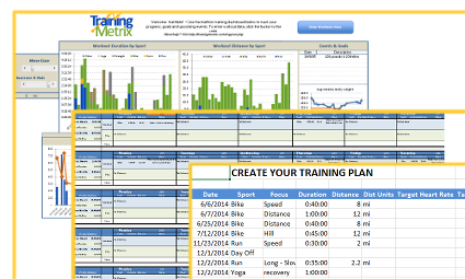
Track progess, merge your plan and workouts into a calendar view, and create/modify your own training plan, the Calendar View Template is a powerful for triathletes
I am excited to show off this latest template. We are combining a number of KPIs for triathletes into an easy to use template which resides locally on your computer, so your data is private and protected. Being based in Excel, the template provides a foundation for you to customize and create your own charts and data views. The power of workout progress and trends come alive. The ability to create and modify your training plan is another powerful tool. Lastly, the comparison of training plan to actual workouts is the intelligence the triathlete needs to stay on track, plan ahead and adjust as necessary. For more information, please visit the Calendar View Template website.
What’s next for TrainingMetrix and I? A lot, stay tuned, we are just getting started with understanding this intersection, data and triathlon.
Update 10/15 – TrainingMetrix was shut down in October 2015 due to increasing costs and lack of an effective business model.
A Sample Corporate Sales Dashboard
Monitoring your Sales team performance is very important for the growth of your company whether it is an infant startup or a tenured enterprise. If your company is using a CRM solution, such as Salesforce.com or SugarCRM, you already have a wealth of data to leverage. The trick is to get the right level of actionable data in front of the stakeholders who need it to make a decision.
A Sample Sales Team Dashboard
The dashboard’s purpose below is to communicate the health of a sales team for a company based in Canada. The stakeholder required a view of sales by region and product category. In addition, they wanted visibility into product returns and profitability. We used Tableau Public to create the dashboard below with a Canada Superstore data set available for free. So let’s dive into the dashboard and some of the insights it gives us.
Sales Team Performance
 The first three charts on the dashboard illustrate which regions and product categories are driving the most gross revenue. The first heat map shows Product Category against Region with the darker green color indicating more revenue. The conclusion is the West drives the most revenue of the regions, with Nunavut bringing up the rear. However, technology sales are highest in the West, whereas other regions have a more equal distribution.
The second heat map shows Customer Segment against Product Category. Corporate customers tend to drive the most revenue, with technology and furniture being the highest revenue generator. The lowest generator is Consumer Office Supplies.
Anti-Cloud Based Tools for Personal Intelligence
Creating a personal intelligence platform for self tracking has never been easier. While technology continues to push us toward the “cloud” and SaaS as a strategy of revenue generation, we cannot overlook the tried and true platforms available to keep data on your computer and away from prying eyes of Analysts.
As a data visualization and KPI development guru, I love finding those interesting trends in my own life that drive smarter, better habits. If you are like me, you don’t feel comfortable sharing your dirty underwear with Mark Zuckerberg and you really wonder what Google is doing with all of that data they keep acquiring. By maintaining a self database on my desktop computer which I can add to and tweak at a whim, I am able to give myself peace of mind and control over MY data. Curious, about what KPI’s I track? Stay tuned, that is a topic of another post.
Without further ado, here are some tools that you can use to create your own personal intelligence platform on your local computer:
- Microsoft Excel
- A stunningly powerful tool to use for even the novice user. Create your own tables, link them how you want and design your own graphs and dashboards at your own pace and complexity. Available for both Windows and Mac.
- Numbers
- A Mac only platform designed to compete directly Microsoft Excel which offers much the same functionality, but lacks some advanced capability compared with Excel. The simplicity and robust visual que are 2nd to none, but as the data set grows, you may be wishing you chose Excel in the beginning.
- Qlikview Free
- I have been a fan of Qlikview for years. I love the ability to create charts and dashboards from Excel spreadsheets and the gnarly level of interactivity that it provides. The learning curve isn’t as steep as one might think and well worth a few minutes reading their documentation. The limitation here is the limited number of shared files you can open. Windows only.
- MySQL / Apache / PHP / HTML5 / HighCharts
- Ok, if you are going with this option, you are a true geek with coding ability. This isn’t for the lighthearted as configuring MySQL, Apache, etc etc will take time. But the advantage is you are left with an enterprise class database and a truly blank slate in regards to dashboards. You can even create your own forms in HTML to add data. Mac/Linux/Windows
- Microsoft Access
- If you need something in between Excel and MySQL to store data, Access is a great option and can interface with Excel graphs and dashboards. With a mild learning curve, the ability to store any kind of data, and the convenience of a query builder UI, Access makes for a very robust solution. But, it lacks more advanced visualization, so be prepared to connect Excel to Access. Windows only and available with Office Professional.
As you can see, creating a Personal Intelligence platform off the cloud is possible. You can take full control of your data and keep it private at the same time. As data becomes more and more of a commodity and SaaS business models continue to nickel and dime everything, home based data management will be more and more appealing. Excel is the perfect anti-cloud.
What Makes a KPI Special
 A key performance indicator (KPI) is a vital tool for an organization seeking grow smart profits, expand customer loyalty, and build a scalable workforce. While many companies stick a chronological set of numbers on a chart to project it on a wall in front of stakeholders, the reality is what they are seeing may not be a true KPI. Its just a number unless its special.
To be special, the number needs to have most of the following characteristics in common:
- Represents a hierarchy either by time, or by dimension
- Example: Sales broken by Year, Quarter, Month, Week or even day, then sliced by Sales Region
- Directly actionable with each stakeholder holding a piece of the action.
- Example: Sales are down 15% from goal, Sales Managers, Marketing Coordinators, etc can all speak to how their actions influenced the number
- Has common definition across departments throughout the company
- Example: A sale is an action by a user from a variety of channels and promotions that resulted in payment and excludes affiliates for instance. This definition is signed off by Marketing, Customer Service, Sales, and Product.
- Does not include hidden meaning and/or does not hide a trend
- Example: A number compared year over year, month over month completely ignores a trend that can be alarming. While sales could be up year over year, this metric could hide a sudden drop in sales from the beginning of the year.
- When displayed with other metrics on a dashboard, the number represents a part of the story and does not represent a conflict to other metrics.
- Example: A number is where a chart shows Sales sky-rocketing, but another chart shows New Revenue way down, and yet another charts show Average Deal Size (ADS) flat. The three charts give conflicting information, so one or more can’t be a true KPI for this business. In fact, in this case, Sales is the corrupted KPI as it does not conform to a standardized definition.
- Supporting data is transparent
- Example: Analysts should be able to review aggregate data that rolls up to the KPI for audit reasons. It provides transparency and allows for drill down capabilities. Often the Analysts receive direct support from a data team are sourced from data sources throughout the business.
- The number evolves with the business
- Example: A number is just a number unless it can change readily with the business. A team supports the KPI, new data is added when created, and definitions evolve as the understanding of the business evolves.
- A goal can easily be set and tracked from the number
- Example: If the number is fully understood, a goal can be set and tracked against. If you can’t answer, “Where do we need to be by the end of the Year?”, then its a number, not a KPI.
Throughout my career, I’ve seen numbers and I’ve seen KPI’s. The most successful companies I worked with not only have a data team to support their KPIs, but they engage in regular discussions of the KPIs at all levels of the business. Successful, scalable, and profitable businesses are the ones using special numbers at their core.
When was the last time you saw a number masquerading as a KPI?
Data Perspectives – Trial Users
One of the keys to getting customers hooked on your SaaS product is offering a free trial. Letting someone experience your product for free for seven to thirty days is a great way to establish trust with the potential customer, let them experience the product, and also gain insight into how they will use the product (customer segmentation).
On a recent project, I was reviewing data for a client and noticed a very interesting pattern in the login histories (not really, but we will call it logins since the real data can’t be shared) for trial users. This particular client offered a 7-day credit card trial with auto convert to a selected plan (i.e. monthly or annual). What I expected was a nice curve from day 1, declining each day, relatively smoothly and then an increase in logins after conversion.
However, after summarizing the login data for the first ten days of service (including 3 days for the auto convert), I found a sharp decrease in logins from day 1 and day 2, as well as a blip on day 6. See the chart below.

What was even more fascinating is how the other analysts and “experts” at the company interpreted this data. Some of the comments are below:
- “Wow, people pay us and use less?” – referring to the drop is usage on day 8 after becoming a paying customer
- “Those auto convert reminder emails are working, driving usage!” – referring to the increase in logins one day prior to trial end on day 6
- “Looks like we need pay per login” – referring to the sharp decline in logins from day 1 to day 2
- “If we can get the customer to use beyond day 4, we have them!” – not sure how this really fits in as we haven’t correlated logins with LTV, yet
- “People are cheap” – referring to the people logging in on day 6 to use the product prior to cancellation
- “If you are going to login to cancel your auto convert on day 6, wouldn’t you try the product one last time?” – again, referring to day 6
The chart is quite simple, a single line with 10 data points. What isn’t simple is really what this data means. In fact, I don’t think we can make a decision directly from this data. Rather we need to further understand what the trial users are actually doing on day 6 and how users with logins on day 7 compare to the users on day 1 (is this a bad a marketing channel). It would also be great to dive into patterns of logins just prior to churn or trial cancellation.
What fascinates me the most, is not only the different perspectives on the data, but the deeper questions that come out of the data. Data and customer insights are evolutionary. The more you know, the more you ask questions and the more the decisions and knowledge evolve.
Triathlon Training Dashboard: Chart Two | Aric In Training

The second installment of a series discussing metrics pertinent for a triathlon training dashboard. In this installment, we answer the question, “Is the athlete investing enough time each day to achieve their goals?”

You must be logged in to post a comment.